Chee’s Bakery App Case Study
Timeline
- February – April 2022 (9 weeks)
My Role
I was responsible for all the design process in the project. I did everything from user research, through to the prototyping. This is part of my Google Professional UX Design Certification Program.
Project Overview
The product:
Chees Bakery is a mobile app that allows users to easily order baked product and get it delivered to their homes or workplaces without having to go the bakery store physically..
Problem:
Users want to purchase baked product without going to the store physically
Some users have tight and busy schedules and would want to purchase a baked product but finds it difficult to go the Bakery store physically. They don’t want to walk to the bakery store and wait in a long queue.
Solution:
Therefore, I came up with a solution, Chees Bakery which helps users easily order baked product from the comfort of their homes or workplaces and increase their satisfaction.

The goal of the case study:
My goal of this study was to ideate solutions and create prototypes of a product which development process and iterations are derived from insights from concluded user research studies and usability tests.
My Role
As the sole designer and researcher on this project, I was responsible for the entire research, ideation and design process.
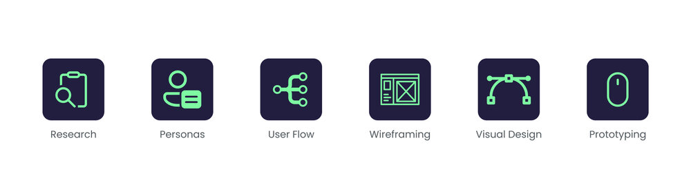
My Design process is:
Foundational Research:
SUMMARY
However, I did a series of first user interviews to have a better understanding of what customers could desire from a bakery app and what their existing challenges with their process of purchasing baked product. I conducted the research by asking family and friends that frequently go to the bakery store nearby a series of open ended questions about their experiences
Based on the reports they gave me, I found out several pain points, analyzed and group them into core insights which are listed below.

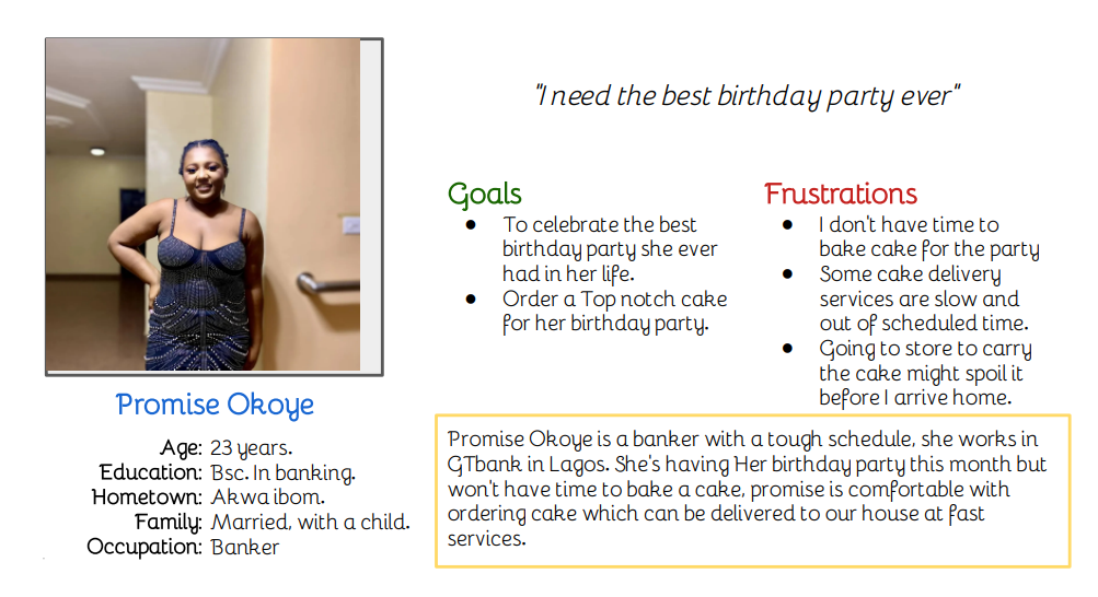
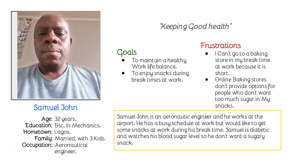
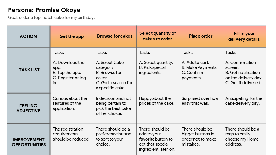
PERSONA
In the user foundational research, the people that personify those themes were grouped under a specific persona – a fictional personality who’s goal and traits reflect the demands of a set of users.
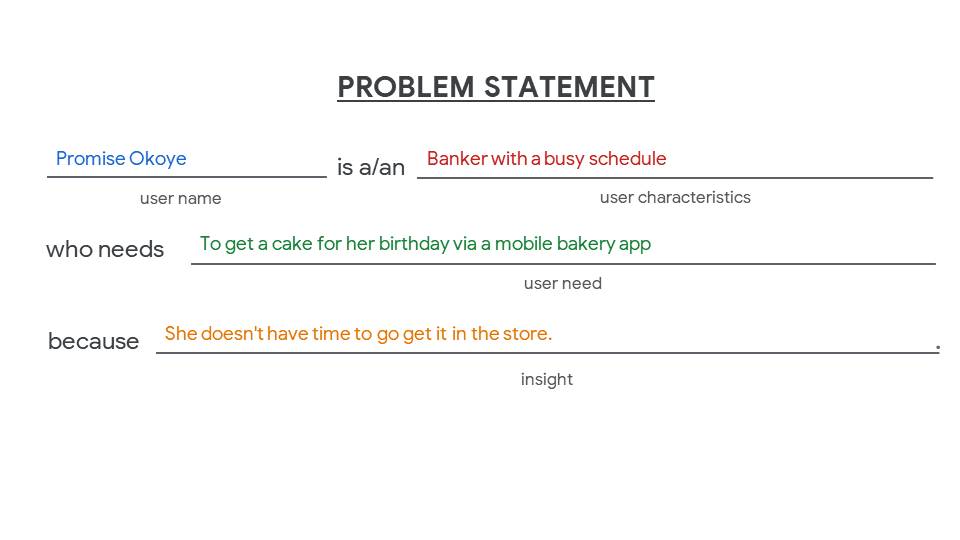
PROBLEM STATEMENT
USER JOURNEY
To fully understand users interactions with bakery and emphasize where their difficulties are so that a solution could be created, I designed a journey map
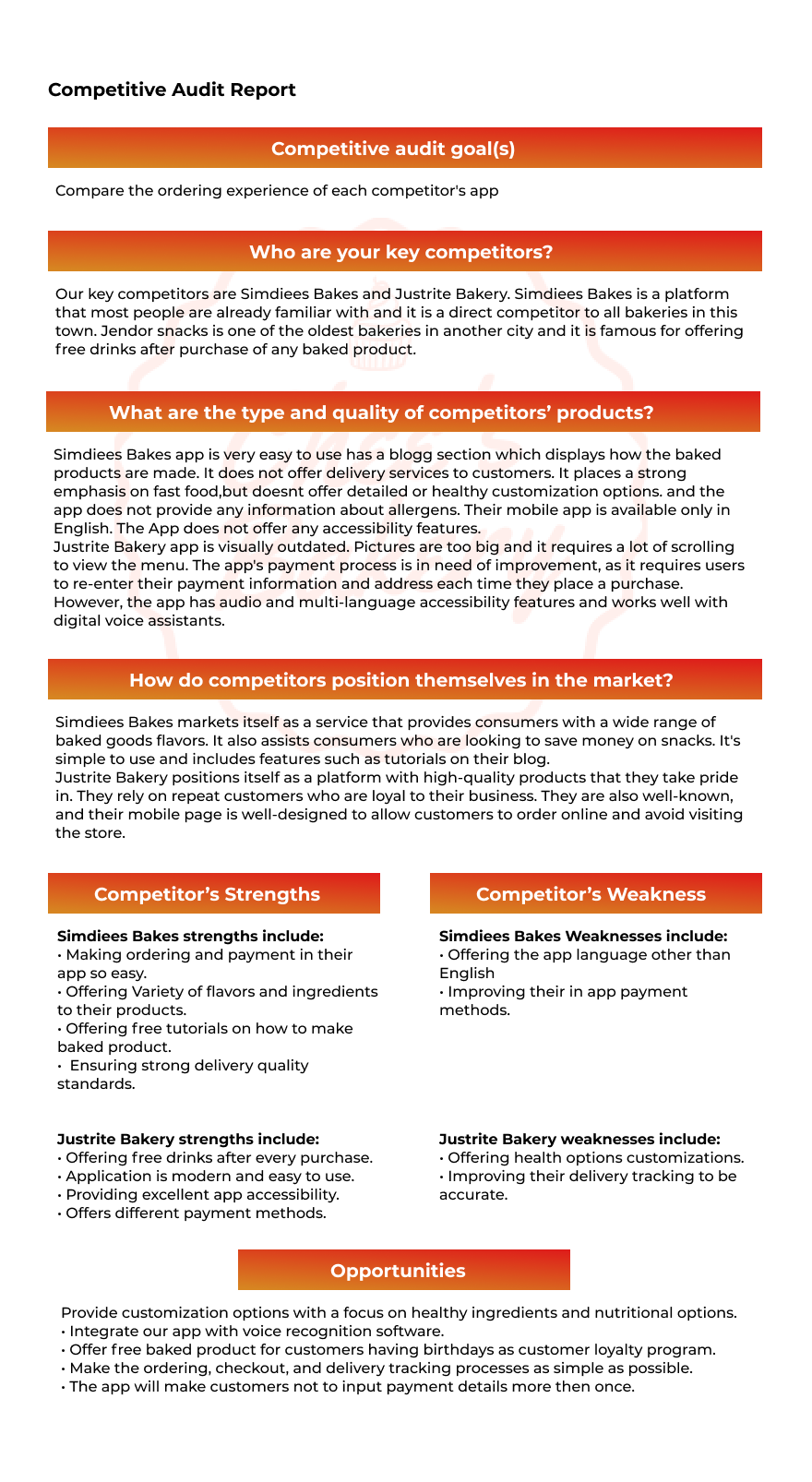
COMPETITIVE AUDIT
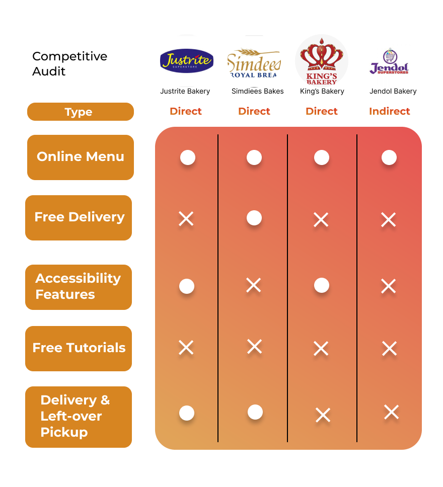
COMPETITIVE REPORT
Ideation
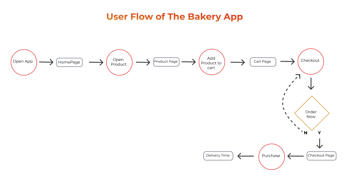
In the Ideation process, to create the journey through the app and how the pages are connected, I created the user flow which helps at the wireframing stage.
USER FLOW
BIG PICTURE STORYBOARD
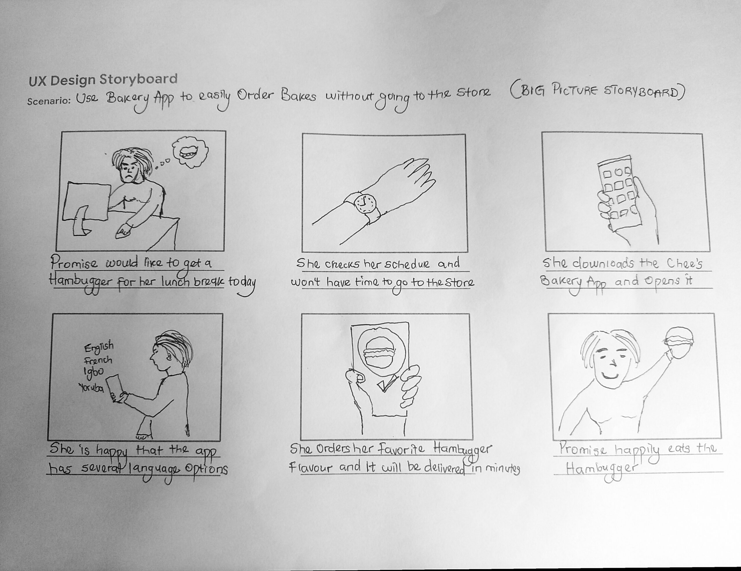
CLOSE-UP STORYBOARD

Wireframing
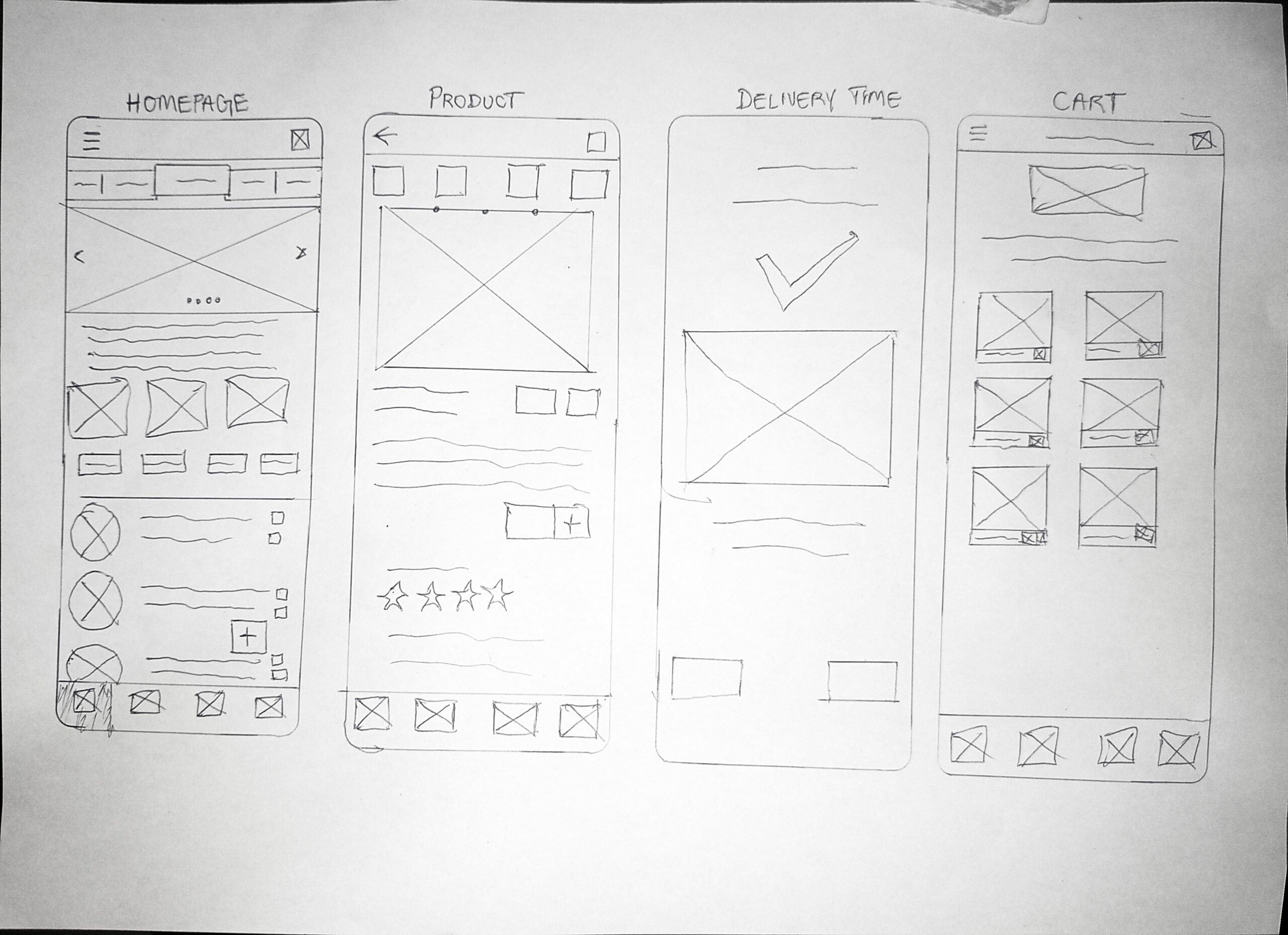
PAPER WIREFRAMES
I Started wireframing with the use of paper and I ensured that lots of initial ideas could be sketched out quickly, then I went on to create the wireframe digitally on my computer and finally to the high fidelity prototype.
Therefore the initial wireframe, version 1 (V1) of a low fidelity prototype was created. It was done with simple lines and elements digitally on Figma.
V1 DIGITAL WIREFRAME
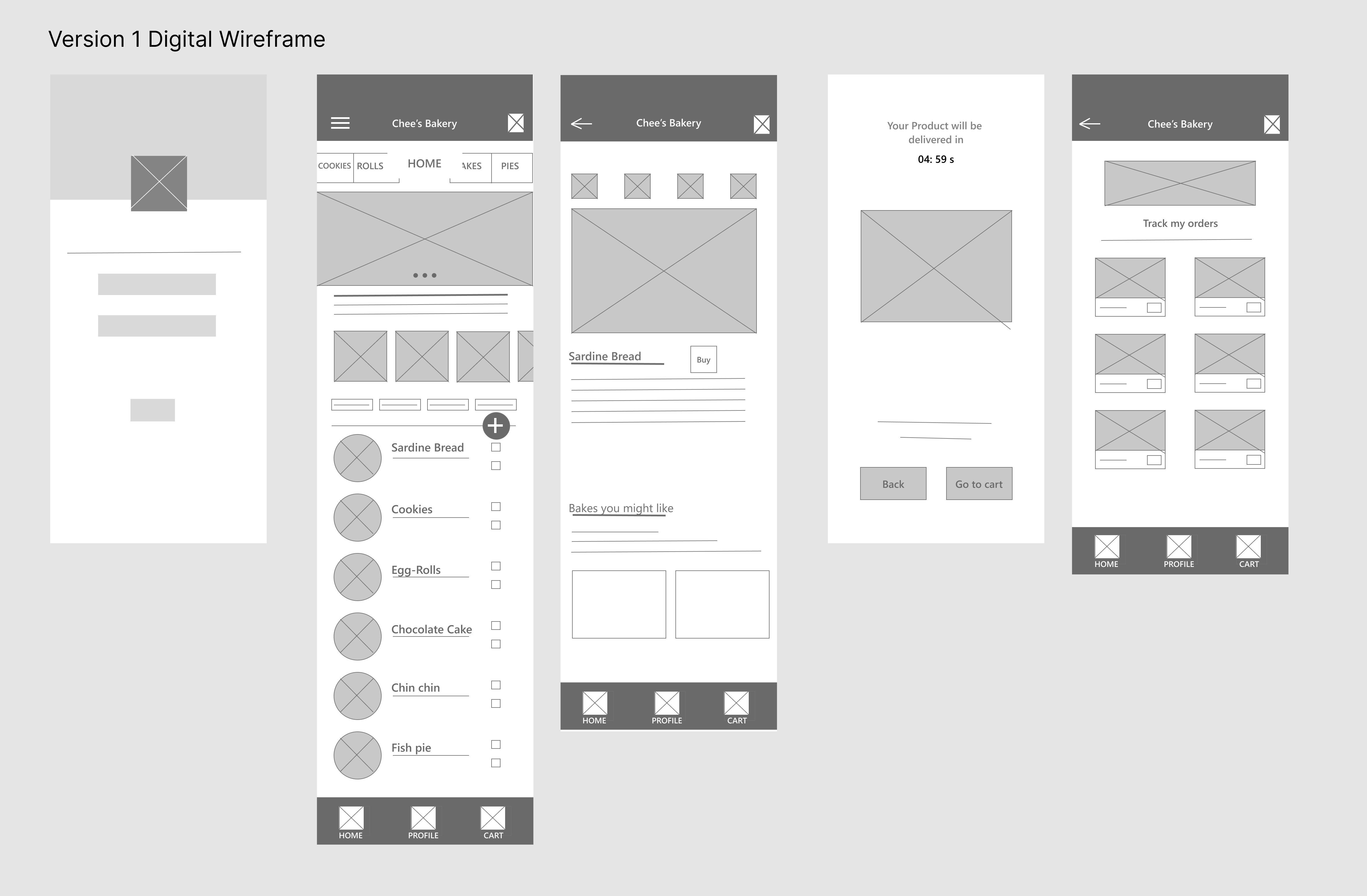
LOW FIDELITY PROTOTYPE
I did a series of usability tests by conducting a Unmodified structured interview with the same people I interviewed using the above prototype, and asked users to complete a simple task, such as using the app to order an item. I monitored how the users did during the test and then ask them a series of questions about their experience and any challenges they encountered.
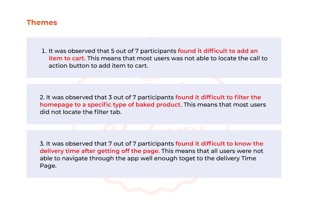
I collected the data from the interview, analyzed it in a spreadsheet and derived themes and insights from the observations of users during the testing.
The Themes and insights from the usability test are:
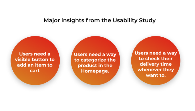
Insights
Improvements
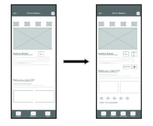
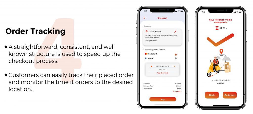
The first iteration i made to the wireframe was adding another menu in the tap to easily check and monitor the delivery time, Then I added a button to set the amount of item to buy as well as a rating system.
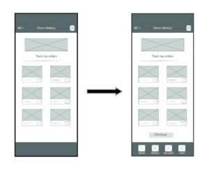
I also added a button which allows users to checkout because there was no button for that in the Cart Page.
After making some improvements, I went ahead to prototype the wireframe again and did another usability testing where the users confirmed that the issue has been resolved.
HIGH FIDELITY PROTOTYPE
IMPROVEMENTS
The first Version of the high-fidelity is shown above. This version was prototyped and went through one more round of user testing with the same participants. Here are the major complaints by the participants who participated in the user testing.
- The animation to transition from my page to another is slow.
- Some title of items did not match the picture of the item.
- Users would not want to be sign up to use the app, they want a skip button that would take them straight to the homepage.
- Some buttons were too small and we’re difficult to tap.
Therefore, I understood their complaints and I resolved the issue by improving the design of the high Fidelity Prototype.
ACCESSIBILITY CONSIDERATIONS
- The Mobile application does not only support English Language, it has other languages for users who don’t understand English Language.
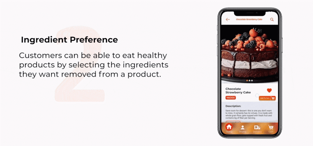
- It considers user’s health by adding an option to add or remove ingredients from the item they want to purchase.
- Most call to action buttons are large enough to tap and it allows comfortable one hand use because it is placed at the lower part of the screen.
The final Product

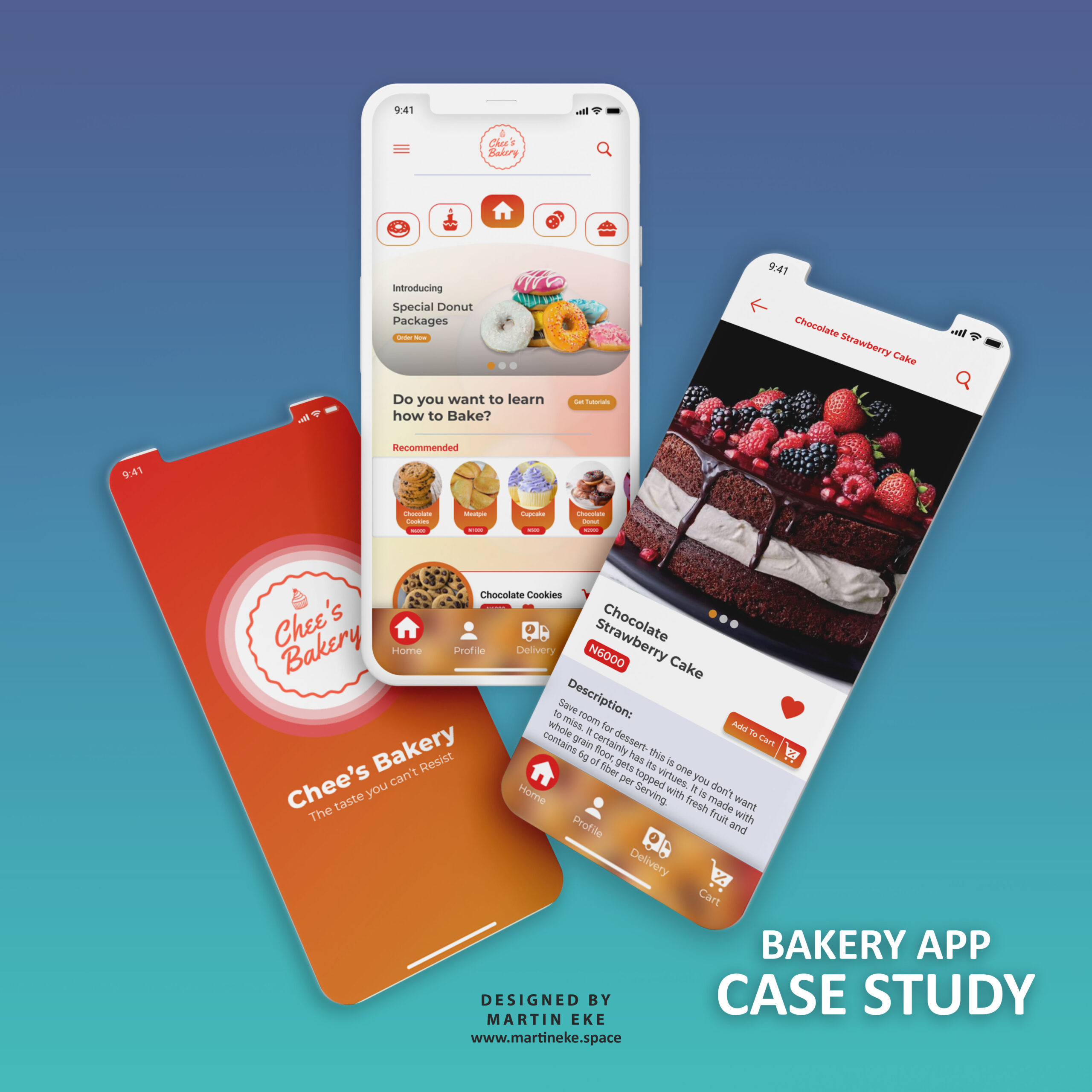
Link to my Figma Project Here
CONCLUSION
Lessons I have learnt from this project
- Iterations: Iterations are very important in mobile app design. There must surely be improvements. I made about 4 iterations to the design to make sure every aspect of it allows users have good experience with the app.
- Asking for reviews: I’m glad to have constantly asked for reviews from peers and mentors. This is because perspectives differ and it is always good to get other relevant opinions. Moreso, I want to achieve the main objective which is to put the user first.
- Working with insights: When I started the research process to gather pain points, it was hectic because I got more complicated pain points. But I realized that if I analyse those data and derive data from it, I would be able to get the best pain points.